
Scripts - Plotting Data
Summary:
Plots are one of the most important tools for working with measured data, and ProSEM scripting has capability to draw a large variety of plots with great flexibility. This page gives examples of different plotting capabilities. It's not possible to create a generic plot script, because there are so many different types of measurement data, and so many different plot types, but it many cases, it's easy to modify a script to produce the desired plot results quickly and easily.
ProSEM includes the MATPLOTLIB plotting library, one of the most popular and powerful plotting packages for Python. In addition to the main project website, there are hundreds of other websites and tutorials available online.
Demonstrates:
- Plotting measurement data in a variety of plot formats
- Plots displayed interactively, and saved to files
Demonstration Scripts Included with ProSEM
There are demonstration projects included with ProSEM, each of which draws a plot, one a line plot and one a histogram, one to the screen, the other to a file to be included as part of a report. Since these are complete projects, they can give you an instant example of the possibilities. It is important to note, however, that these included demonstration projects are structured differently than user scripts, because they don't operate on the current project, but rather on a saved project included with ProSEM, so adapting the entire demonstration script is to user projects requires quite a bit of editing. Therefore, it is recommended they be used to see the techniques, but not necessarily as a starting project for user scripts. The scripts from this page should make better starting scripts for user projects, but will likely need some modification to adapt to the exact needs of the user's data.
Plotting with Scripts: Basic Structure
Scripts which draw plots still follow the overall script structure as described here [Link Needed]. In general, the action portion of the script can be divided into a fewsections:
- Optional: if needed, get user input. For example, the Demonstration Script to apply different specifications to measurements asks the user to choose a specification from a list of example specifications. User input typically uses Wx Dialogs [Link Needed].
- Collect and organize the data necessary for the plot. This depends both the structure of the data to be plotted, and the type of plot to be made. As examples:
- A line plot of measured linewidth versus exposure dose would typically need the data in two different Python Lists, with one entry in each list per (x,y) pair, one list containing the CD measurement, the other list containing the corresponding Exposure Dose for each point.
- A boxplot where each box shows the range of measurements for each image, with a unique box for each image. This requires a list of lists, where each sub-list contains all of the data points for a single box in the plot, and the major list contains one sub-list for each box.
- Draw the plot using Matplotlib commands. Some very simple plots can be made in only 2 or 3 lines of code; adding more features such as labeling, adding annotation text, constraining the axis scaling, controlling optional features of the plots, all require additional commands.
Example Plot # 1 - Linewidths in a Grating
Consider the grating measured in this image. For a simple plot, let's just draw the linewidth for each line in this grating.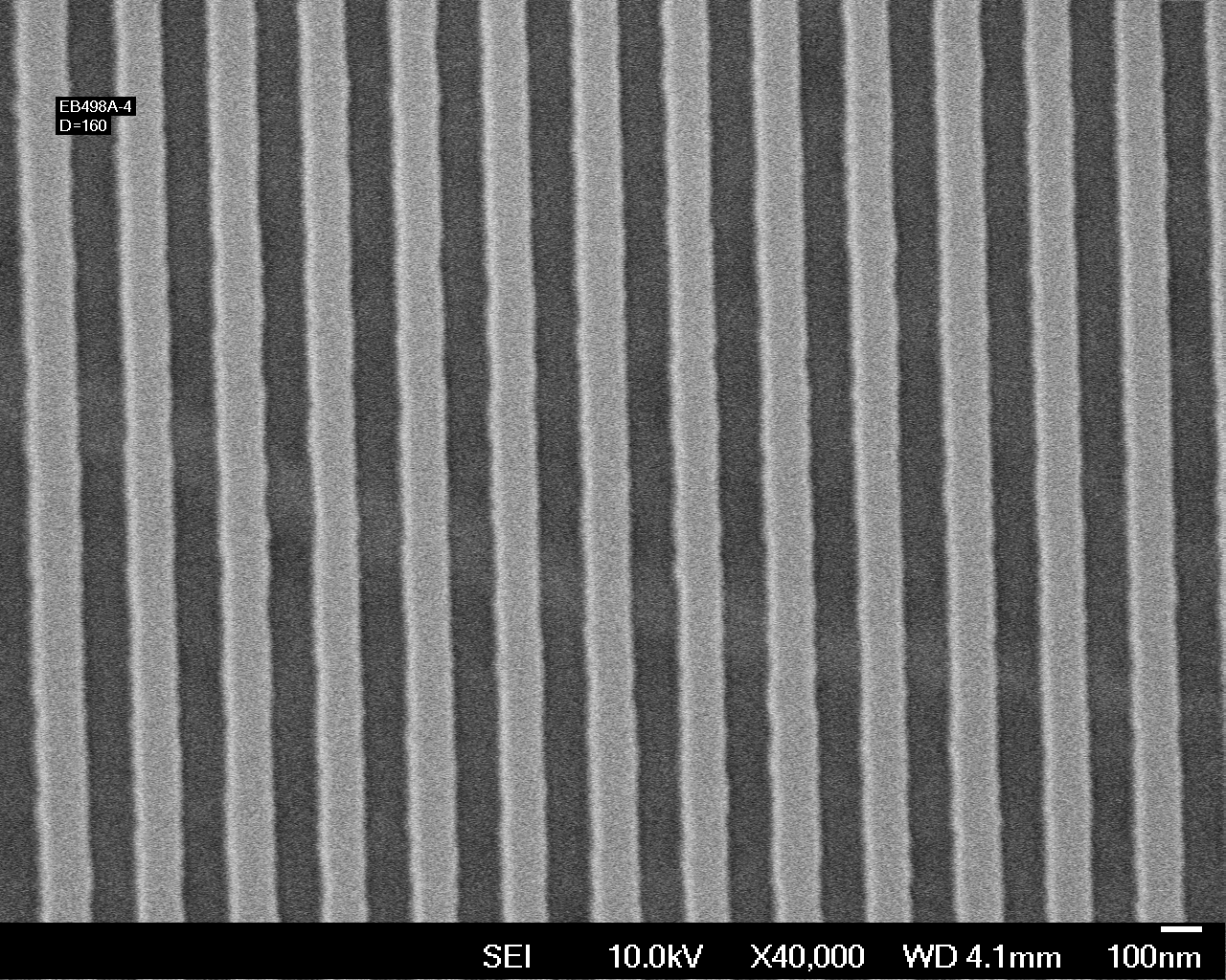
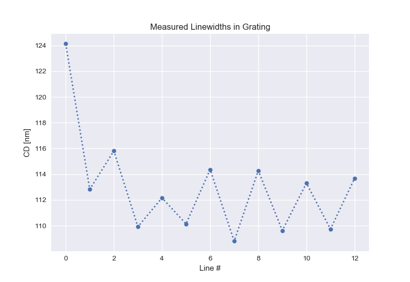
The script code to draw this plot is shown below. This is starting simple: this is a very basic script with no checking on the data or handling of errors. For example, there is no handling for cases such as if there are no lines in the project, and if there are multiple images, all data will be plotted on the same axis in serial order. But it's a simple start.
Code Comments:
- In the program heading, the matplotlib library is included with:
import matplotlib.pyplot as plt - For this one-dimensional plot, all data points to plot are collected into the list:
CDList - The triple-nested loop steps through all stored measurements in all groups in all images. For each stored measurement that is a line, the Mean CD is appended to a list of data points to draw on the plot.
- The plot here is drawn in 7 lines of matplotlib code:
- The
plt.style.usesetting is entirely optional; I just happen to like the style and color scheme using this setup. You can have a look at the available pre-defined styles at the matplolib documentation website.- The
plt.plotcall draws the actual line plot, with the X coordinates a simple ordinal index list, and the Y coordinates the CD mean for each line. There are many optional settings available controlling how the plot is drawn. In this example, the data marker is set to a solid circle with a size of 6 points, and the line style set to a dotted line having a width of 2 points. - The
plt.xlabelandplt.ylabelcalls just label the X and Y axes. The X axis label shows how to handle ProSEM user choice of units. The measurement data is provided in user units, and will be plotted in those units, so referencingprosem.MeasurementUnitin the axis label will have the correct unit displayed in the label. There are many optional settings available to control the placement and appearance of these labels. - The
plt.titleprovides the label at the top of the plot; again, many available options to control appearance of titles. - The
plt.showcall causes matplotlib to draw the plot and show it to the user in an interactive window. The user can zoom, modify some plotting parameters, and save plots from this interactive window. When this interactive window is displayed, it must first be closed to return to the script and thus return to ProSEM.
- The
Example Plot # 1 Code
# -*- coding: utf8 -*-
#
# Simple demo plot of linewidths in a grating.
#
# The graphics are using the matplotlib library; for documentation of this extensive
# and powerful library, see:  https://matplotlib.org/
#

from ProSEMpy import *
import os,sys
import matplotlib.pyplot as plt

def process(prosem):
    '''
    Draws a simple plot of linewdith (Mean CD) for each line in a grating.
    '''

#    First, collect the data to be plotted in a list of numbers.
    CDList = []                        # create an empty list to store the measurements

    for image in prosem:              # Loop through each image in the project
        for group in image:           # Loop through each group in the image
            for item in group:        # Loop through each measurement in  the group
                if (isinstance(item,GMetrologyLinesSpaces)):  # If this is a line, keep the mean CD for plotting
                    CDList.append(item.CDMean)

#   And now draw a plot of this data
    plt.style.use('seaborn')        # optional, but prettier than the default color scheme
    plt.plot(list(range(len(CDList))), CDList , marker='o', linestyle=':', linewidth=2, markersize=6)
    plt.xlabel('Line #')
    plt.ylabel('CD ['+prosem.MeasurementUnit+']')
    plt.title('Measured Linewidths in Grating')
    plt.show()

############################################################
# When called as a program, load a project passed on the command line,
# process it, then save it back to the original file:
if __name__ == '__main__':
    import os
    import traceback
    pause = False
    error = 1
    try:
        prosem = GProSEM()
        project = sys.argv[1]
        print("Loading {0!r}...".format(project), end=" ", file=sys.stderr)
        prosem.load_project(project)
        print("{0} images".format(len(prosem)), file=sys.stderr)
        os.chdir(prosem.base)
        if process(prosem):
            pause = False
        error = 0
    except KeyboardInterrupt:
        pause = False
    except:
        traceback.print_exc()
    if pause:
        print("Press enter to continue...", file=sys.stderr)
        sys.stdin.read(1)
    sys.exit(error)
Example Plot # 2 - Linewidths in a Grating Plot With More Features
The same image, but now the linewidth is measured at 5 different Y locations within the same image, maybe to see if there the CD depends on Y-position in the image. The plot has more optional features, just to demonstrate how some common plot additions might be accomplished.
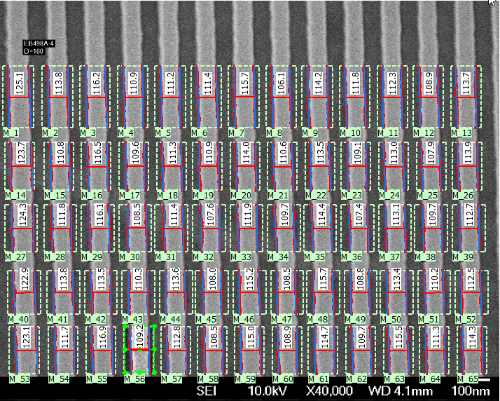
The script code to draw this plot is shown below. The significant changes in this plot from the first example include:
- There are five lines drawn in the plot instead of one. In the data gathering phase, the data for each line is gathered in its own list, with all data collected in a list of lists.
- The X axis is now actual X position in the image, so X position is stored for each data point as well.
- The mean for all data is computed, drawn on the plot as an added horizontal line, and labeled as the mean, including the mean value.
- A different style if used, just to show how different plots can look from a single change.
- A legend is drawn to identify the different lines in the plot
- The name of the image file is overlaid on the plot
Example Plot # 2 Code
# -*- coding: utf8 -*-
#
# Simple demo plot of linewidths in a grating.
#
# The graphics are using the matplotlib library; for documentation of this extensive
# and powerful library, see: https://matplotlib.org/
#
# Import classes from the ProSEMpy scripting interface:
from ProSEMpy import *
from os import path
import sys
import csv
import matplotlib.pyplot as plt
from matplotlib import colors
import itertools
# Processing method, which can also be used from other scripts
# importing this one as a library.
def process(prosem):
'''
More complex plot, with 5 sets of data on a single axis
For plotting each set of data on a seperate line, the data will be stored in lists of lists
'''
# First, collect the data to be plotted in a list of numbers.
XPosList = [] # empty list to store x position of each line
YPosList = []
CDList = [] # empty list to store the cd measurement of each line
GroupLabelList = []
GroupCDMeanList = []
for image in prosem: # Loop through each image in the project
for group in image: # Loop through each group in the image
thisXList = [] # Need to store a seperate list of each group in this image, then append each completed group to the main list
thisYList = []
thisCDList = []
for item in group: # Loop through each measurement in the group
if (isinstance(item,GMetrologyLinesSpaces)):
thisXList.append(item.CenterX)
thisYList.append(item.CenterY)
thisCDList.append(item.CDMean)
XPosList.append(thisXList)
YPosList.append(thisYList)
CDList.append(thisCDList)
thisYMean = sum(thisYList)/len(thisYList)
thisCDMean = sum(thisCDList)/len(thisCDList)
thisLabel = 'Y={:5.1f}'.format(thisYMean)
GroupLabelList.append(thisLabel)
GroupCDMeanList.append(thisCDMean)
# And now draw the plot, one line for each group in the project
plt.style.use('Solarize_Light2') # optional, but prettier than the default color scheme
markers=['^', 's', 'p', 'h', '8']
textcolor='dimgrey'
for i,thisCDList in enumerate(CDList):
thisPlotLine = plt.plot(XPosList[i], thisCDList, linestyle='-', linewidth=2, alpha=0.6, marker=markers[i], markersize=6,label=GroupLabelList[i])
ax=plt.gca()
plt.xlabel('X Position in Image ['+prosem.MeasurementUnit+']')
plt.ylabel('CD ['+prosem.MeasurementUnit+']')
overallCDMean = sum(sum(CDList,[]))/len(sum(CDList,[]))
plt.axhline(y=overallCDMean,color=textcolor,linestyle='dotted')
thisLabel = ' Mean CD\n ={:5.1f} {}'.format(overallCDMean,prosem.MeasurementUnit)
plt.text(max(sum(XPosList,[])),overallCDMean+0.5,thisLabel,color=textcolor,ha='left')
plt.title('Measured Linewidths in Grating',color=textcolor)
ax.legend(loc='upper right',title='Y Position in Image')
ax.set_xlim(xmax=(ax.get_xlim()[1])*1.20)
ax.text(0.05,0.95,"Image: {}".format(image.label),transform=ax.transAxes,color='black',fontsize=9)
plt.show()
############################################################
# When called as a program, load a project passed on the command line,
# process it, then save it back to the original file:
if __name__ == '__main__':
import os
import traceback
pause = False
error = 1
try:
prosem = GProSEM()
project = sys.argv[1]
print("Loading {0!r}...".format(project), end=" ", file=sys.stderr)
prosem.load_project(project)
print("{0} images".format(len(prosem)), file=sys.stderr)
os.chdir(prosem.base)
if process(prosem):
pause = False
error = 0
except KeyboardInterrupt:
pause = False
except:
traceback.print_exc()
if pause:
print("Press enter to continue...", file=sys.stderr)
sys.stdin.read(1)
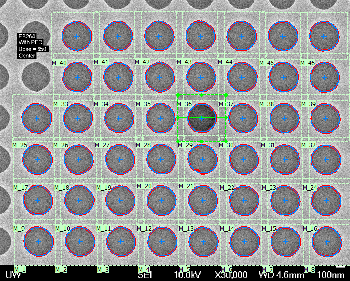
sys.exit(error)Example Plot # 3 - Box Plot of Circle Diameters in Different Images
For this example, consider a set of images similar to the one shown here, each containing an array of circular dots fitted by ellipses in ProSEM. The plot here is a boxplot showing the measured values for the major diameter of each ellipse, with individual values shown by small dots in the boxes. Boxplots are quite useful for plotting measurement data such as this, since useful information such as mean, spread of data, as well as number and character of outlier measurements are all shown in a single plot.
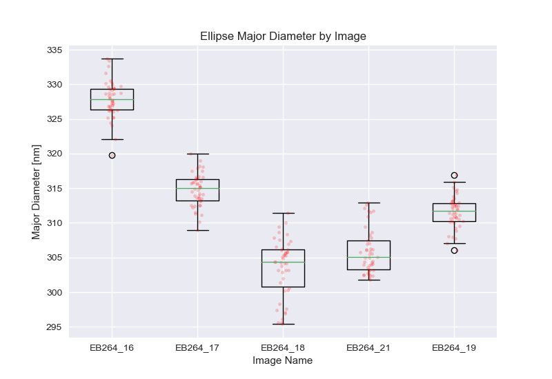
Faster Data Access
A significant difference in this plot is the method in which the data is accessed. As described on this page, [LINK NEEDED], for larger volumes of data, reading the individual data items from Python is slow, whereas reading all of the data in a single command, and then parsing the data entirely within Python is much faster. That method is used here.
Plot Code Comments
The BoxPlot takes the data as a list of lists, one higher-level list of each box to plot, with each list therein containing all of the data points for that box.
MATPLOTLIB has many optional settings for Boxplots, but here the plot is just a basic boxplot, except for the addition of dots added for each data point.
MATPLOTLIB does not directly contain a method to draw dots for each data point, but that is easily achieved by just three lines of code to plot a 'dot' symbol at the location of each data point, in each box, with some small random variation in x coordinate to make viewing the distinct points easier.
Example Plot # 3 Code
# ... section under construction ...